RIT SportsZone Intro
modeling, texturing, lighting, design
Modeling


Concept Design
Featured


modeling, texturing, lighting, design
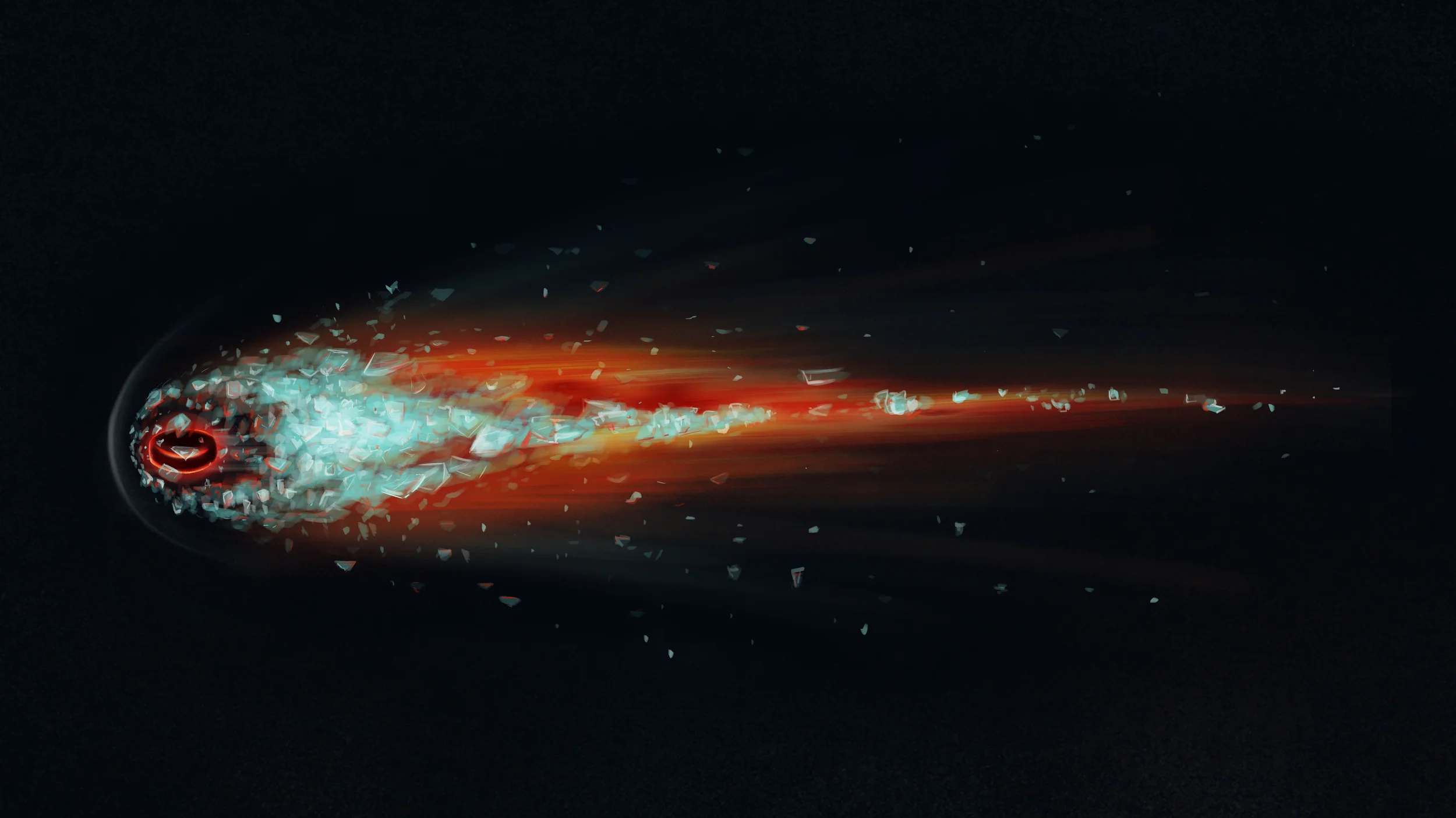
The final design of the comet took a couple of days to get across, mostly because with such an abstract yet realistic concept, being on the same page as the director of the project from texture to light to color can be challenging.
My first attempt was too dark and flat. The colors were too cool and was too far off from the director's vision.
I tried a different color pallet this time and aimed for something more abstract and fluid. I went far too fluid.
I when for something that looked a little heavier and dangerous looking. I was a little closer with the color but it was too stumpy to look threatening.
When I asked for feedback on the last three paintings, the project director scribbled this on the back of some scrap paper. For some reason, everything clicked in that moment between us and I understood exactly what she wanted. You don't need a masterpiece to get a concept across.
Once again this is the final concept of that process. It's what came to my head as soon as I saw my director's doodle. It's striking, sharp, dangerous, and beautiful.
The concept for the Hockey intro was originally, extremely different. It involved CG hockey players going up against one another. Here's the test Animation we did for that, modeled by Levi Davis, and rigged by Levi and myself.